Platinum Jubilee flyers and posters
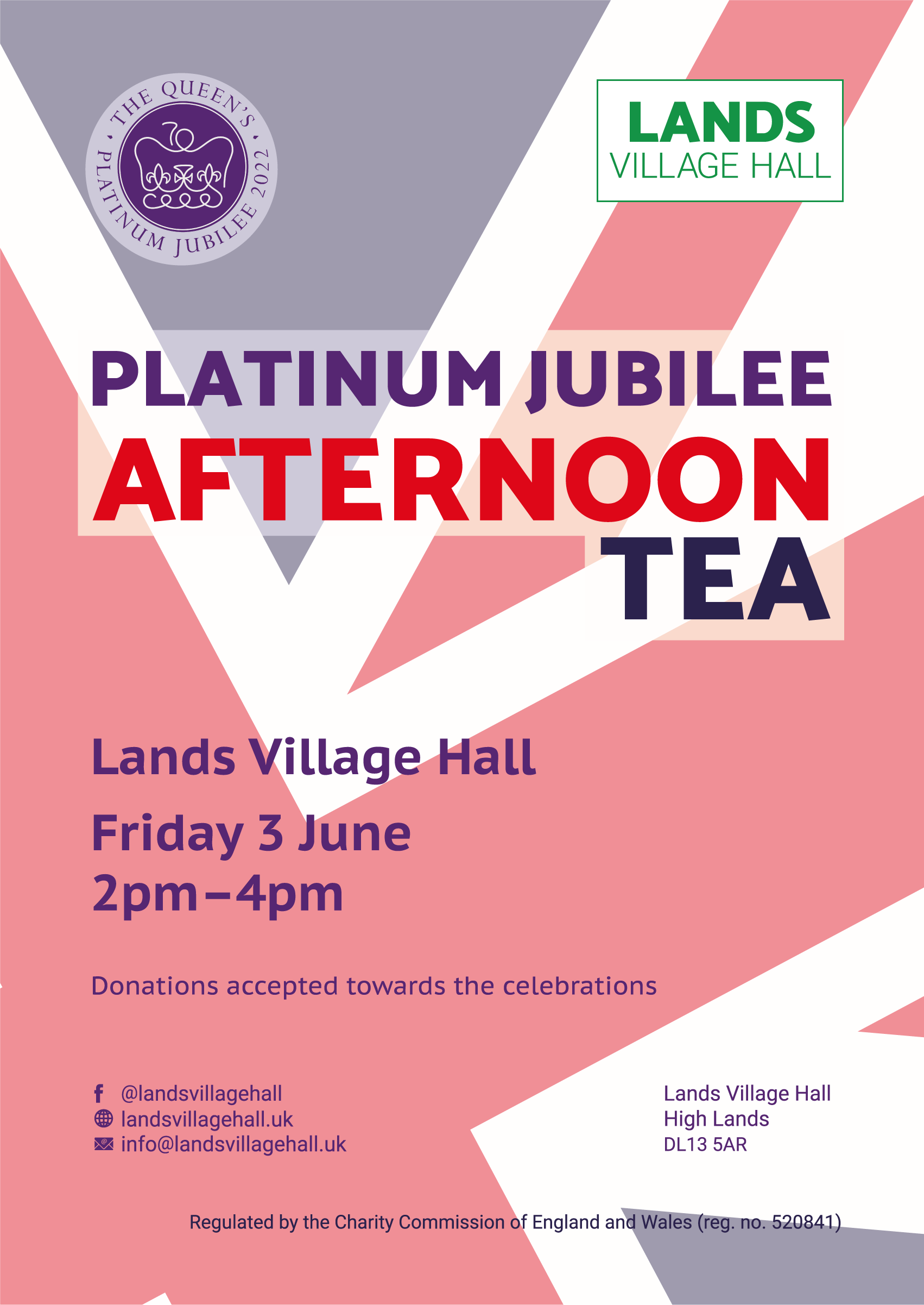
Lands Village Hall Trust wanted some high–quality printed flyers and posters designed and printed to support a marketing campaign for their Platinum Jubilee Afternoon Tea. Having worked with the Trust on several projects and developed their branding guidelines, it was natural for the Trust to approach us to undertake this project.
Scope
Lands Village Hall Trust approached us to design and print some A5 flyers and A1 posters to support the marketing of their Platinum Jubilee Afternoon Tea event. We have worked with the Trust several times before, and it was a natural progression for them to contact us and ask us to complete this project for them.
The job was necessary to publicise a unique event at the hall to celebrate the Queen’s Platinum Jubilee. The posters and flyers had to work together as a united theme and needed to meet the client’s branding guidelines while having sufficient impact to capture the attention of the intended audience.
The client requested the design relatively late because the Trust took time to decide the format of its events to mark the Jubilee weekend in June 2022. The project had a set deadline, which was the Jubilee weekend at the beginning of June, and the client was concerned that this looming date would impinge their ability to market the event. In addition, every village in the vicinity was hosting similar celebrations, and the Trust needed to ensure their event was noticeable amongst the cluster of events for that weekend.
So, our design had to take up some of these concerns. It needed boldness and impact in the face of alternative options in the vicinity.
With the imposed time constraints, we decided that a single element theme should work well: it should aid the boldness of the design in a crowded market. We limited the print run because the Trust was concerned they would be unable to distribute a large batch of flyers before the event, and the A1 posters would be available to offer an additional marketing channel.
Our solution
Immediately, we decided to put aside all motifs that might limit the boldness of our design or that several other halls were already using for posters and leaflets. With this tactic, we already avoided using pictures of the Queen (past and present) and images of Union Flag bunting, street parties and the Crown Jewels. Local event publicity already overused such motifs.
We decided to take a theme–red, white, and blue–and superimpose it over a skewed image of the Union Flag. This theme avoided clichés like bunting and party tables while providing sufficient impact in colour, simplicity and boldness of design.
This method proved insightful as no other local venues had used that motif as a single entity, and the simplicity of the design lent itself to the message.
We were pleased that the client was impressed with the design and liked its simplicity while using the Union Flag as the backdrop. Once the client approved the design concept, we worked on developing the layout into a finished product that worked well in both A5 and A1 formats.
Successes
We completed the project on time and within budget. Despite facing considerable time constraints in this particular undertaking, we successfully created a bold design that betrayed little of its simplicity.
The design was sufficiently bold that the local community was quickly aware of the event, and the project created an immediate buzz.
The design lent itself well to the change in size between A5 and A1. This mutability was possible because we did not create the Union Flag background from an image: it was produced and drawn using vector graphics, which enabled us to scale it according to the needs of the format without worrying about printing defects.
Challenges
One unexpected challenge for the project was the creation of a vector Union Flag background. While the Union Flag may appear to be simply a set of crosses all superimposed over one another, this appearance is far from the truth!
Even though we used a small portion of the Union Flag motif in the design, we created the whole flag and took out the part we wanted to use. This approach allowed us to adjust the layout for the larger format with suitable adjustments.
We used a box filter behind the primary copy to avoid it clashing with the bold colours of the flag. To assist with this approach, we reduced the saturation of the flag so that it merged into the background.
Impacts of the project
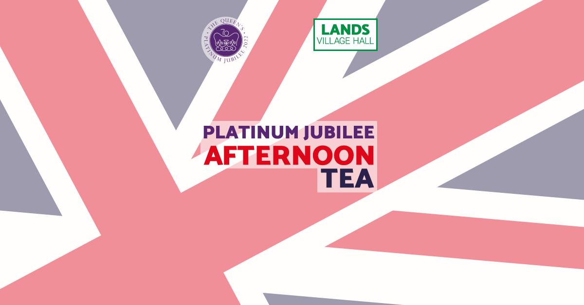
The project successfully advertised the Trust’s event, which was well–attended on the day. The local community was aware of the event directly because of the design. Additionally, the completed design supported the Trust’s Facebook advertising with a bespoke version for Facebook events.
PDF download
You can download a copy of this case study for your reference here (downloads a PDF file of this case study to your computer) .


